

The story below is illustrative. It is a composite built from patterns we see when we audit specialist Shopify stores. The numbers are examples, not data from any one store.
Imagine Sam. He runs a Shopify store that sells professional-grade car care products. He stocks respected brands, his customers know what they want, and the range is strong. But on busy weekends, visitors arrive, browse and leave without buying.
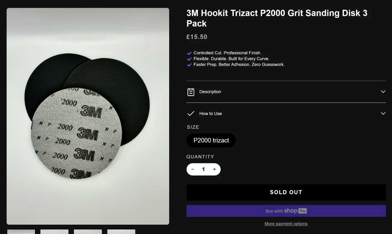
Sam decides to shop his own store on his phone, as a stranger would. He searches for a product he knows well. The product page is good, but as he scrolls down to read the usage instructions, the Add to Cart button scrolls out of sight. When he finally finds it again, the top of the category page is full of products he cannot buy.
That evening Sam found five Shopify conversion leaks. This guide walks through them in the order we would fix them.
A note on evidence: these examples are illustrations built from common patterns. Measure your own store before acting.
Leak 1: The Add to Cart button disappears on mobile
The story moment. Sam reads a long product description on his phone. The button that would let him buy is at the top of the page, and he has scrolled past it.
What goes wrong. On a phone, the buying decision is made halfway down the page, after the shopper has read the details. If the button is not visible at that point, the shopper has to scroll back up, and many will not bother.
Audit estimate: our audit estimated a 25% to 40% rise in add-to-cart rate from a sticky add-to-cart bar on mobile. This is an estimate for the audited store, not a measured result for any store. Test your own before you rely on it.

How to fix it:
- Test a product page on a real phone. Scroll to the middle of the description and check whether you can still add to cart without scrolling back.
- Add a sticky bar at the bottom of the screen with the product price and an Add to Cart button. Keep it visible as the shopper scrolls. Test it before you keep it: published A/B tests show mixed results, with some tests lifting add-to-cart clicks while lowering overall conversion.
- Check that the bar does not cover the size or variant selector or the checkout buttons.
Leak 2: Sold-out products at the top of the collection
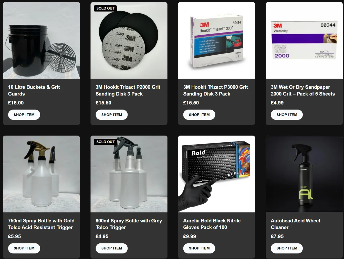
The story moment. Sam opens a popular category. The first row is full of best sellers marked as sold out.
What goes wrong. Shoppers judge a category by its first few rows. If those are unavailable, the page feels empty, and the shopper who clicks into a sold-out product usually does not come back to the list to find an alternative.
Audit estimate: our audit estimated that the chance a shopper returns to the list after landing on a sold-out product falls by more than 60%. This is an estimate, not a measured result.
How to fix it:
- Check your collection sort order. “Best selling” often keeps sold-out items at the top.
- Move out-of-stock products to the end of each collection. Several Shopify themes and collection-sorting tools can do this automatically. Test the one you choose.
- Add back-in-stock alerts on products you will restock.
For the full sold-out sorting approach, see our earlier post on Shopify store mistakes.
Leak 3: No ratings on product pages
The story moment. Sam’s most expensive product is a premium coating. It has happy customers, but no review or rating appears on its page.
What goes wrong. For a premium purchase, shoppers want proof from other people. Without it, they are asked to trust the seller’s word alone.
How to fix it:
- Choose a review app that fits your theme and asks customers for reviews by email after delivery. Photo reviews help when the result is visible, such as shine or finish.
- Show the average rating near the product title, and the full reviews lower down.
- Check your structured data for product price, availability and rating. Remove duplicates if your theme and your review app both output them.
- Only show reviews that real customers wrote and that you are allowed to display.
Leak 4: Nothing to add after the first item goes in the cart
The story moment. Sam adds a product to his cart. The drawer shows that item and a checkout button, and nothing else. He has to go back and search for the accessory he also needs.
What goes wrong. Shoppers at the moment of adding to cart are the most willing to buy more. If the cart does not help them find the next item, they rarely go looking.
Audit estimate: our audit estimated a 15% to 20% rise in average order value from cart suggestions and a delivery progress bar. This is an estimate, not a measured result.
How to fix it:
- Suggest a related item in the cart drawer, for example an applicator or a cloth with a product that needs one.
- Show a free-delivery progress bar in the cart if you offer a threshold, such as “You are £X away from free delivery.” Use your real threshold.
- Test that suggestions work on mobile and do not hide the total or the checkout button.
For the checkout side of the same problem, see our earlier post on Shopify checkout improvements.
Leak 5: Trade customers have no clear route to sign up
The story moment. A professional valeter wants to buy in bulk. The trade section is a contact form. Sam has to wait for an email reply before he knows whether there is a discount.

What goes wrong. Trade buyers are often the most valuable customers. A contact form with no stated benefits feels slow and leaves them to compare you with a larger supplier.
How to fix it:
- State the trade benefits on the trade page: who qualifies, what discount tiers exist and how sign-up works.
- Use a short sign-up form that tags approved trade customers in Shopify, so trade pricing applies without a manual code.
- Confirm the approval process and the time it takes before you promise anything.
Frequently asked questions
Which fix should I do first?
Start with the mobile Add to Cart and the sold-out sort. They are usually quick to change and affect every visit.
Do I need an app for every fix?
No. Some changes are theme settings or simple code. Others need an app. Compare the options and remove anything you do not need.
Find the leaks before you spend more on traffic
Sam’s story is illustrative, but the pattern is common. Small problems on the product page, in the cart and in the trade route add up.
That is what a Shopify CRO audit is for. Shopikings is a Conversion Rate Optimisation agency for e-commerce and local businesses in the UK, the US and Canada. Our e-Commerce CRO Audit is $299 and includes a free 30-minute consultation.
Book your free audit consultation
Shopikings Team